Also available in: Français
Behind this catchy title lies a book whose content has been compiled and structured over several years. This book offers you the chance to discover and rediscover the good practices and mistakes that are still very common and that damage the user experience and can, more often than you think, cost you money and opportunities.
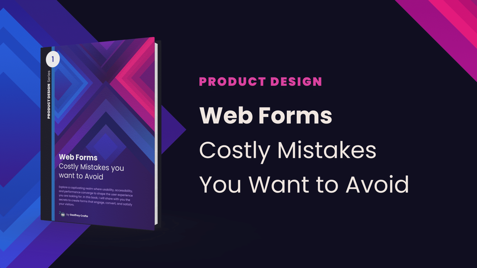
Explore a captivating realm where usability, accessibility, and performance converge to shape the user experience you are looking for. In this book, I will share with you the secrets to create forms that engage, convert, and satisfy your visitors.
Synopsis of the book “Web Forms”
Every day, billions of people browse the web in search of information, products, or services. At the core of this digital experience are web forms, these small dialog boxes that ask us to fill in our information. At first glance, they may seem simple, but don’t be fooled: they are the bridge between your visitors and your online goals.
After 14 years delving into the complex world of web (forms), I have discovered a fascinating realm where ergonomics, accessibility, and performance come together to shape the user experience. In this book, I will share with you the secrets to creating forms that engage, convert, and satisfy your visitors.
Imagine a form that seems to anticipate the user’s needs, that reduces input errors, that loads quickly on all devices, and that welcomes every visitor, regardless of their disability. It’s possible, and that’s exactly what we’ll explore together.
Whether you’re a web professional, an entrepreneur, or simply curious about the behind-the-scenes of web form design, this book is for you. Get ready to dive into the exciting world of form ergonomics and quality, where every detail matters and every improvement can transform the user experience.
Are you ready to discover the secrets of web forms that make a difference? Then let’s dive together into this captivating journey towards accessibility, performance, and excellence!
Who is the book for?
My idea in writing this book was to focus on designers, developers, project managers and product owners. For me, these profiles share responsibility for the user experience around the development of digital solutions (website or application). Certainly because I’ve been through all these profiles in the course of my career.
The reality is quite different, and so much the better.
After just one week’s launch, my readers have already given me some very rewarding feedback. Apart from the typos left here and there (it happens to everyone I suppose 😃) I’ve had feedback from back-end developers, a Business Owner and a marketing expert who have all learned interesting things from reading the first chapters, each at their own level.
The first feedback I received on the content’s target audience was as follows:
I found the content useful for all professionals looking to create customer-focused forms and who also have a ‘business’ vision, as everything explained has an impact on the experience, conversions and therefore the figures. You’re targeting a very broad audience and your content is relevant and well explained.
—Dondu Karabinar
It’s always better with readers’ own terms, and maybe that will help you assess whether this is the book for you. Thank you Dondu for your honesty 💕
I’ll update this article as feedback comes in.
Contents, chapters and size of the book
When I wrote it, I didn’t count the pages or the words, I didn’t really have a numerical objective, my main aim was not to be too long, and to avoid debating opinions. My aim is to provide a consistent and coherent approach to the subject of creating and improving web forms, whether simple or complex, to give you some food for thought and feedback on my 14 years of experience.
This book is also a valuable addition to the web quality checklist on forms published at the end of 2022.
All in all, this book represents:
- 250+ pages in a A4 format (356 “e-book” pages says Amazon, whatever that means)
- 13 main chapters
- 42 000 words
- 2 formats: ePub and accessible PDF
- A printed book available on Amazon
On the contents side, you’ll find these various chapters full of frankness, discussion and accessible, qualitative, well-argued proposals. Without offering you an exhaustive plan, we will go through:
- Possible definitions of a web form (not a boring one I promise)
- Experiences with a web form
- Examples of poor usage, from the real to the absurd
- Around the form: existing, training and service.
- Back to the usability basics of a field
- Discover new field types and functions
- Typical forms and typical solutions
- The importance of user research
- Monitoring and measurement
- Making your forms accessible: definition and solutions
- Some use cases: challenges and critical thinking
To dispel any doubts about the nature of content and the difficulty of understanding it, here is some feedback from a former colleague and marketing expert.
[…] very accessible content, even for me as a marketer. At first I thought “wow, 254 pages might be a bit long for a simple form”, but in the end it wasn’t!
Thank you so much for sharing your feedback on reading these first chapters 😊
Many thanks also to my visible and less visible contributors:
- Stéphanie Walter for the forewords and support,
- Alexis Degryse for the french proof-read,
- Michaël Crofte for another part of the proof-read in french,
- And all the people whose stories and experiences I quote in this book.
How can you buy this book?
The book comes, for the moment, in 2 formats if you buy it via my own official shop, ePub and PDF. It can also come with its checklist in printable PDF format, if you wish to apply it in a professional context to a current or future project.
Since 30 of April, it has also been available in Kindle format and printed format (2 quality, Hardcover, and paperback), which I myself have not yet been able to try out. (Thanks Amazon 😅)
For one month from 1st May to 1st June, my official shop is offering the eBook + its checklist at the same price as the eBook alone. Don’t miss out!
Oh, and one last thing: I want to offer this book at the best price depending on your situation. If you are in a temporarily financially unpleasant situation, contact me so that I can make you a more suitable offer 💕 (no judgement on my part, I’ve been there)
Happy reading to you, and don’t hesitate to share your reading opinions with me so I can improve this book.
I can’t stop you from sharing this book with someone you think might find it interesting.
In the Product Design Series of books
I’m sure you got it by reading these lines, this book don’t come alone. I’ve wrote another one to start a series of books focused on those little things that put together will allow your digital product to stand out in terms of usability, user experience, and efficiency.
Book 1 – Web Forms: Costly Mistake You Want to Avoid

Buy this book
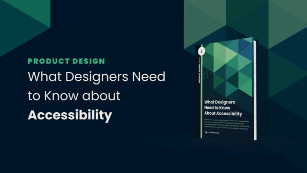
Book 2 – What Designers Need to Know About Accessibility

More info about this book
Next books of the series
Well, I don’t know yet, but from my years of experience in digital product, I might want to cover some other topics like:
-
Design Systems: from theory to practice. How to know if you really need a Design System, and how to create it effectively so that it is adopted by all your teams. This book would be accompanied by practical examples and would be based on real facts from the field.
-
Collaboration between Designers and Developers. Why and how to improve collaboration between these two key profiles in a web or application project. It’s certainly a subject that’s been close to my heart for a long time.
-
Your search forms are costing you money. Or how cognitive and cultural biases can come into conflict when designing an internal search form for your website. How to design them better, what mistakes to avoid, and what solutions really work.
-
Accessibility: demystifying front-end development. Or how to integrate accessibility into the notion of quality for your front-end, going through the basic principles of accessibility, the keys to integrating it from the ground up, and the tools that can make your job easier.
- How to promote the benefits of design in your company? Or how it is easy to start from the wrong foot, and embark people in better understand what you do, what the benefits from working with you, and how you can promote your values by matching the companies ones.
Maybe other topics too, but I haven’t decided yet. I might tackle Design Systems next. If you have a preference, feel free to let me know!


Post a comment for this article?
Follow comments and trackbacks