Also available in: Français
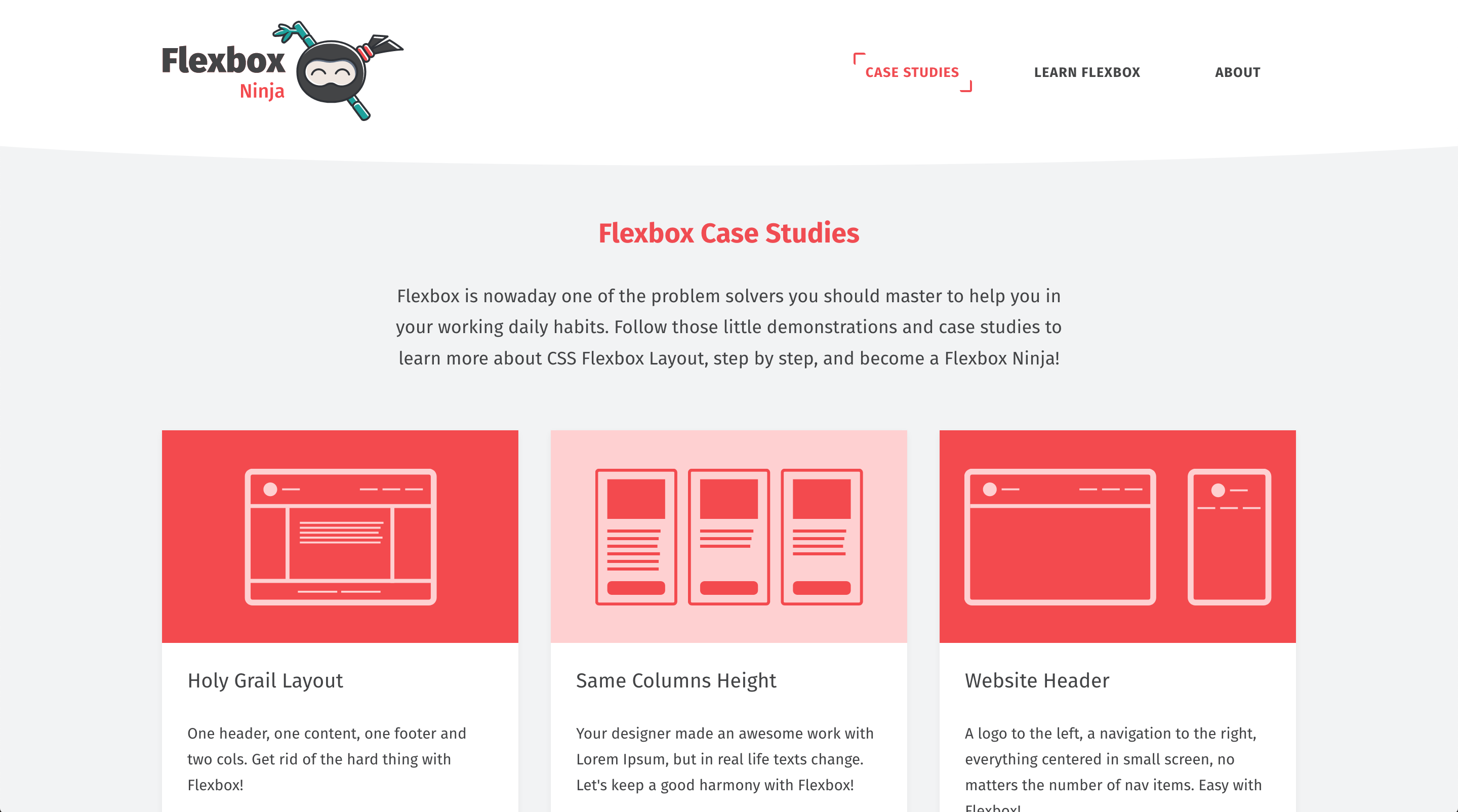
Flexbox.ninja is a project I started a few years ago and that I had never taken the time to finish and publish. I wanted to propose at least 6 common use cases, but the web people suggested that I publish it with 3 cases and open it to contributions. That’s done, now let’s look at it in more detail.
Flexbox: a bit of history
The project started with the W3C specification more than 10 years ago (oh yes already!). 2 years later, the idea of starting to popularize the functioning of CSS Flexbox came to me because the specification contained a lot of new features that were rather difficult to understand, especially because the syntax was revised several times, but also because browsers had a rather disparate interpretation.
The idea of such a tool to browse examples through common practical cases in the daily life of a web integrator/front end developer was therefore still valid. This is how Flexbox.ninja came into being a few weeks ago.
Flexbox.ninja: the tool
The name of the site is a little boastful, but it was more for the originality of the domain than for the level of exhaustiveness of the content, knowing that it only includes 3 common examples at the moment.
The way it works is relatively simple, each example is a precise need in a page from which you can access:
- the detailled code with 1 possible solution (yes, 1 possible…)
- the featured demo
- the same demo downloadable
The little bonus you can access since some recent weeks is the possibility of downloading the Progressive Web App to your smartphone. Easy for android users, you will need to add it to your homepage manually for iOS users. The advantage is that the content you have already viewed online will remain available offline ;p
Thanks to Stéphanie Walter for the little cute ninja by the way 🙂
That’s all for this tool.
Flexbox.ninja’s roadmap
The roadmap is public and available on the Github repository of the project. It includes new coming examples. Among the new ones to be illustrated:
- Align Icons – or how to align icons in a container.
- Vertical-Align Content – how to center vertically.
- Flexible Sidebar – yep, explicit name.
- Stepper Input – an input of type stepper in some CSS lines of code.
- Card Group – a group of cards with the same dimension and an automatic wrapping.
- Flexible Gallery (Masonry) – not sure of the need for that one, will see.
- Pricing Table – a pricing table with a featured pricing.
But if you have examples that you have already coded, you can contribute to the project by respecting the project structure also available on this Github readme. You will of course be mentioned as the creator of the example.
And Grid layout?
Flexbox at the era of Grid Layout: yes, troll gonna trolls. I’m waiting for you in the comments 🙂
Have fun!


Post a comment for this article?
Follow comments and trackbacks