Also available in:
Ones of the more painful experiences on mobile come with infinite online forms you have to fill in here and there. What about optimizing those experiences step by step? Today I propose to you a solution for One Time Code input: You receive the SMS with a code, your keyboard suggest-it to you, one tap, done! Ok let’s go!
Usually when I propose a form, short or long, I want to optimize the experience to make it as less painful as possible. To do so I study the behavior of my users by testing solutions and by enjoying the features that devices bring with new hardware and software versions.
Even if this article looks like a technical one, it comes from user research and some usability rules:
- Input form matches the lenght of the expected data,
- The shapes help the discoverability and ease the intent,
- Input assistance by guiding the user,
- Error anticipation by preventing formatting errors.
The demonstration
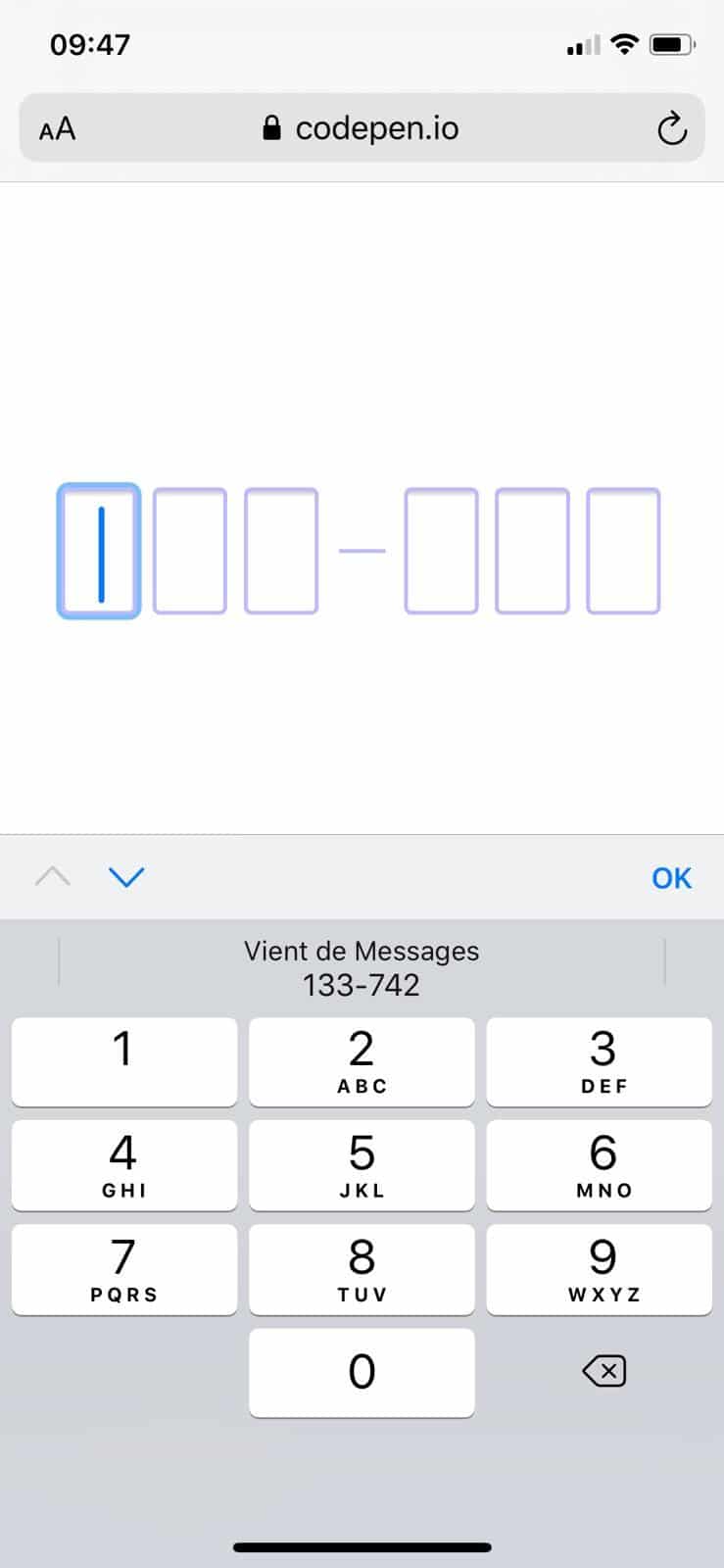
“One tap, done!”, yes, you are in right not to trust me, but here is how you can test it.
- Go to the demonstration page on CodePen: One Time Code Demo.
- Send yourself a SMS with the following text:
- Go back to demonstration page and touch one of the fields.
- Your keyboard should suggest you the last code received.
Sometimes, android just doesn’t care about all of that, it depends on the over-layer of your provider or constructor, or the keyboard you installed and its settings. But if you are on the latest version of iOS, you should be able to manage that like a pro.
How One Time SMS code works?
To make the magic happen, the operating system exposes the last received SMS code to be used by applications like your keyboard. If the current form input asks for this code, your keyboard adapts and proposes the code as keyboard-suggestion.

Ok, but how do you ask for this code? It’s quite simple, but you can’t guess it if you don’t know HTML5 possibilities. Among a lot of uncommon knowledges lays the autocomplete attributes and its numerous values. It’s usage is not that hard, you have to match the value of an existing growing list of standard values.
Once you did that, your One Time Code SMS field is ready. No need for more here.
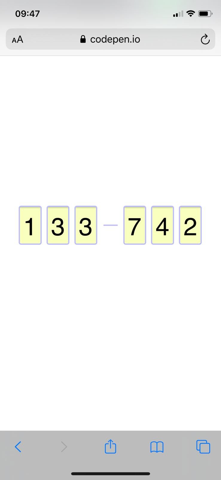
But as I told you, I like being complete in my interface proposition, and I decided to go further with a 6 inputs shaped form.
6 digit SMS code shaped form
I decided to go with a 6 inputs form, but with a 1 input form styled like if it was 6 fields would’ve worked too I suppose. Like I usually say, that’s the magic of HTML/CSS and JS, 1 solution, several ways to reach it.
Why would I do that? Because when the user receive their SMS code, the format is pretty clear: 3 digits, dash, 3 digits. I want my form looks like the code received.
As you can see, I used a fieldset to group the fields under the same legend. Each input has its own label linked thanks to the for and id attributes, as it is recommend for accessibility reason. Despite all those attentions, I’m not sure the solution is that good for screen-readers (maybe a bit too heavy to read), I’ll try to test further after publication and come back to you later.
At the moment, you shouldn’t have the sexiest form of your life. Numeric fields and all those labels… But let’s jump into the CSS part now.
First thing I did is to hide labels visually but not for screen-readers. Code proposed by ffoodd and used in all my projects for a while.
Then I gave dimension to my form to center it, and removed some fieldset and legend default styles (mostly borders and spacings), the flex layout is to anticipate the little dash alignment between the fields.
This code is for styling our inputs of type number, with a little trick for our friend Chrome which needs to be styled thanks to pseudo-classes (l.15). That way, you should already have something more appealing: we sized the fields (mostly thanks to font-size) and removed the spin buttons. Now we just need to “group” the fields 3 by 3. Let’s do that, shall we?
Here I add a dash thanks to a pseudo-element ::before and visually create 2 groups. The pseudo-element act like another child next to all the inputs. If you don’t handle the order thanks to order property, the dash is at the first position. To make it appear at the fourth place I had to tell the 3 last input to be at the second place (order: 2), dash at the first one (order: 1) and others are by default at the zero place (order: 0). Yeah, developers, 0 is kind of first 😀
And voilà!
Put some JavaScript to improve user experience
By splitting the input into 6 inputs, we wanted to improve assistance by guiding the user helping them understand more quickly the format expecting. A more easy to scan information. But for now the form is not usable at all, we made it worst.
We need to cover several things here:
- When I fill in a field, I go to the next one,
- When I delete a content (backspace), I go to the previous field,
- When I click on an empty field, if previous field is empty, I focus it,
- When I copy/paste a code in the first field, I have to split and fill in the other inputs.
Let’s go! I show you the code and explain it just after that.
From line 11 to 13 I do nothing more with the Shift, Tab, CMD, Option, Control keys to avoid issues. From line 16 to 20 I handle the prev/next functions. From 29 to 43 I handle the focus aspect. The idea here is that if I touch/click on a field other than the first one, I force the focus on the first field. This is mostly for smartphone users. But to be smarter, if some fields are already filled in, we focus the first empty one.
The last lines of JavaScript are here to handle a copy/paste action, or the keyboard autosuggestion of a smartphone. In that case, all the code content is put into that first field. We take the value of that field and split it to distribute the values in the next fields.
One Time Code: Takeaways
Ok, we did it. But don’t forget this is a Proof of Concept of mine, it might not be perfect but for my case of use it’s way enough. Some little things to recall and take away with you as a TLD’NR.
- Use
autocomplete="one-time-code"to trigger smartphone OTC auto-suggestion. - Use a combination of
pattern="[0-9]*"andinputtype="numeric"to trigger numeric keyboard on smartphone. - When you create rich forms, try to shape the input to the expected data.
- Don’t forget to test your forms by navigating it with keyboard only, and with a screenreader.
Thanks for reading! I’m open to suggestions in the comments or on Twitter.
Thanks to Laurent for the iOS testing.
Going further with Web Forms and CSS
Did you know that you can style web form inputs like checkboxes or radio buttons with only CSS? Or that you can style input:file for instance? Go further with these articles:


Looks like your code snippets are broken, I’m getting:
[pastacode lang=”css”…
Can you take a look?
Hello Adam,
Thank you so much. Indeed there is something wrong.
I’m gonna check that. (maybe a broken update or something)
Edit: it should be better now, I missed the new option for retro compat (I’m not on Gutenberg yet xD)