Behind this catchy title lies a book whose content has been compiled and structured over several years. This book offers you the chance to discover and rediscover the good practices and mistakes that are still very common and that damage the user experience and can, more often than you think, cost you money and opportunities.
Posts for ‘UX’ keywords
In-App Review: How to ask for a review on the AppStore?

When the design and development of a mobile application reaches its high point, a crucial question arises: when is the right time to ask users for an “In-App Review”, that long-awaited opportunity to gather opinions on the Apple or Android App Store platforms? Find out in this article how to choose the right time to do this, and what you should do to maximise its impact.
What is “Google UX Design Professional Certificate” really worth?
 21
21
The Google UX Design Certificate makes a lot of noise recently. It’s always good to see more kinds of training in our industry. But the real question I was asking myself was: is it really worth it? Well, I enrolled in this course to give you feedback as a professional in UX Design.
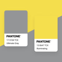
Pantone 2021: Working on an Accessible Color Palette

A lot of people seem to want to play with the Pantone colors of the year. Maybe these colors inspire more creative people. Or maybe it’s because it’s rare to get two of them. Note however that their use in the web, or digital assets, can have an impact on the accessibility of your creations. Small note on this topic.
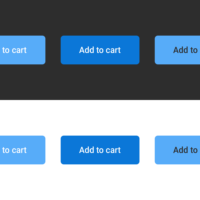
There is no “Myths of Color Contrast Accessibility”

When you need to work on interfaces, color contrast is a real thing you have to take into account to make it accessible. You have the right to be afraid of losing part of the aesthetics of your beautifully well designed interface, and you are right if you are used to poor contrast ratio. Accessibility comes with its constraint, but not much more than UX (User Experience) Design.


