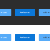
When you need to work on interfaces, color contrast is a real thing you have to take into account to make it accessible. You have the right to be afraid of losing part of the aesthetics of your beautifully well designed interface, and you are right if you are used to poor contrast ratio. Accessibility comes with its constraint, but not much more than UX (User Experience) Design.


