Also available in: Français
Let me tell you the story of the beginning of a side project that offers design suggestions. One of my many projects, but one that for once came to life much faster than expected. Thanks to competent people and (no-code) services that are so easy to use, we were able to concentrate on our content.
It all started on LinkedIn, Colbys was doing one of his design suggestions as he does so well. This involves offering a suggestion for improving the user experience on a product he uses on a daily basis. Adrian responds to him that it would be interesting to centralise this kind of feedback somewhere.
What they don’t know yet, but will learn from this article, is that I’ve been wanting to produce this type of content (website or series of articles) for a while.
So I jumped at the chance to get a domain name (suggest.design) and proposed it to them directly after their discussion on LinkedIn. It was a barely concealed invitation to collaborate. A few days later, Colbys and I were in a video conference to fill in a Startup Canvas. What was the objective? To lay down the first ideas that we would later complete with Adrian.
After 5 videoconference sessions, we are already launching a small website with its first contents. Let me tell you about the few simple steps we took to get there.
Tools for launching a side-project
Nowadays, we have tons of tools at our disposal, here are the ones that have allowed us to progress very quickly in our iterations.
Miro to define the frame of our project
Like any good project, we started our adventure by defining the frame and borders of the project: the vision, the target, the objectives, the key success indicators, the actors, etc. For this we used Miro and a Startup Canvas template, which allowed us to start thinking quickly.
We quickly defined that one of the main objectives is to enjoy ourselves first and foremost, which made it quite easy to make decisions afterwards: if it’s boring or too time-consuming, we don’t do it or we look for another solution.
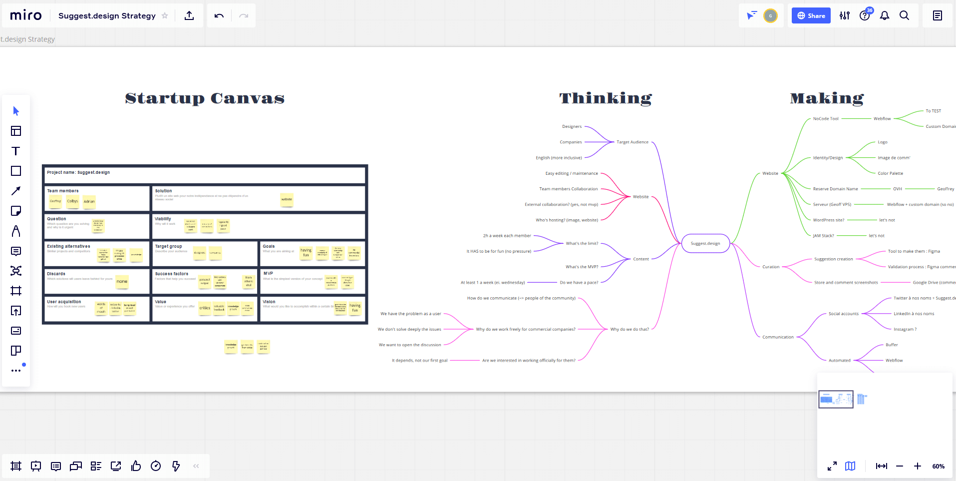
Next to this Startup Canvas is a classic mind map that I often use to make sure I don’t forget anything: in general, at the beginning of a project, the ideas flow and are not blocked by the current project or the objectives. In fact, when you start working on a project, a tunnel effect occurs, and you forget many important things. Putting all the ideas in a mind map in this way allows you to come back to them later if you need to.
Notion to centralise efforts
Notion is a very powerful “note-taking” tool that allows you to create very useful type of content: organised table, kanban, linked content, databases, etc.
The power of Notion lies in the mutability of its content: a ticket in a Kanban can become an article or a page in its own right without having to re-create everything. Colbys and Adrian introduced me to it, and I can’t live without it. I’ve even created a mini-catalogue of my leather work (french only at the moment) for people interested in a home-made creation.
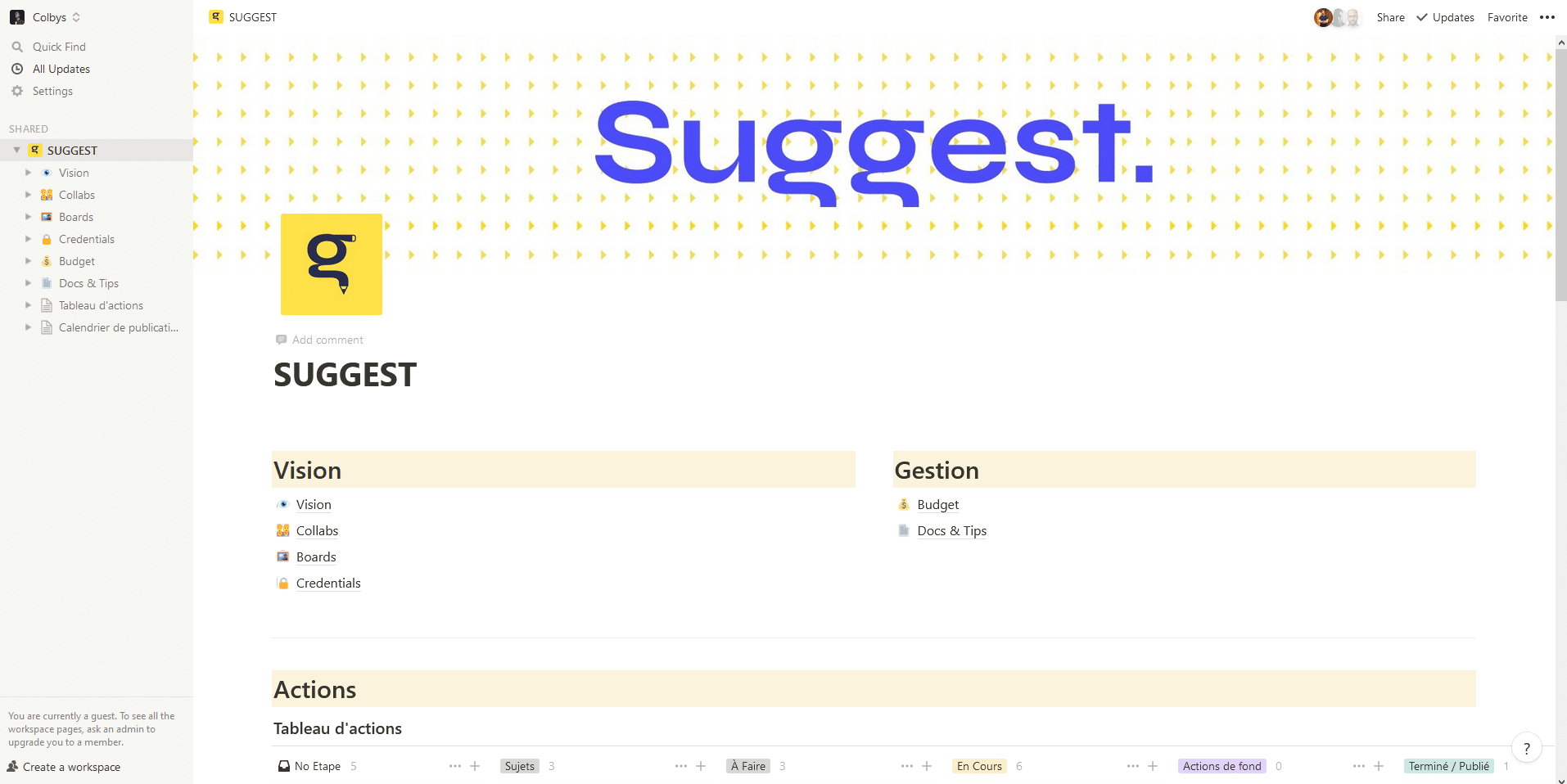
In short, Notion has become our headquarters for centralising our efforts: action proposals, article drafts, content models, first elements of a graphic charter, etc.
It allows us to centralise our actions, to know who is on what and what we need to validate at our next videoconference, without stepping on each other’s toes because of the distance.
Adrian has written an article on the subject of Notion if you want to know more.
Figma for the design suggestions
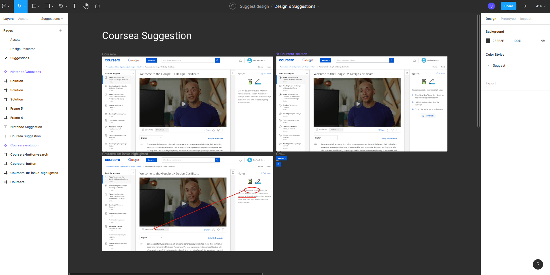
Figma is the perfect place to quickly make collaborative design proposals. We use Google Drive to centralise screenshots of products we want to talk about or fix: the tool allows us to annotate the images to explain to others what we want to improve.
Once we have validated the idea, Figma is used as a working base for our user interface creations and Notion allows us to centralise images and textual content for the presentation of the solution.
We have not yet had the opportunity to challenge the solution of the others, as we have found the subjects rather quick to deal with for the moment. But we intend to take advantage of our strength as a team of 3 to challenge more complex cases in the future. That is possible thanks to the collaboration in Figma, and the visio solutions. Moreover, Figma will introduce Voice Chat in the near future.
Of course we also used other tools for the visual creation of the identity and the notion of color palettes for which Colbys has written a post on the subject. Here is my method for creating the color palette.
Webflow to create the website
Another very good discovery for me during this side project – and this is what makes this type of project interesting – is the more in-depth discovery of Webflow.
This tool allowed us to concentrate on our content without spending too much time on the visual aspect, the theme, and the code of our future website. We listed the first features we wanted, and chose a corresponding theme: TechCues in our case.
The theme is simple, offers a blog-like content with a system of categories, articles, and authors. We just needed to create the notion of tags in the Webflow CMS tool. We adjusted some global styles to create a stronger identity, and that was it.
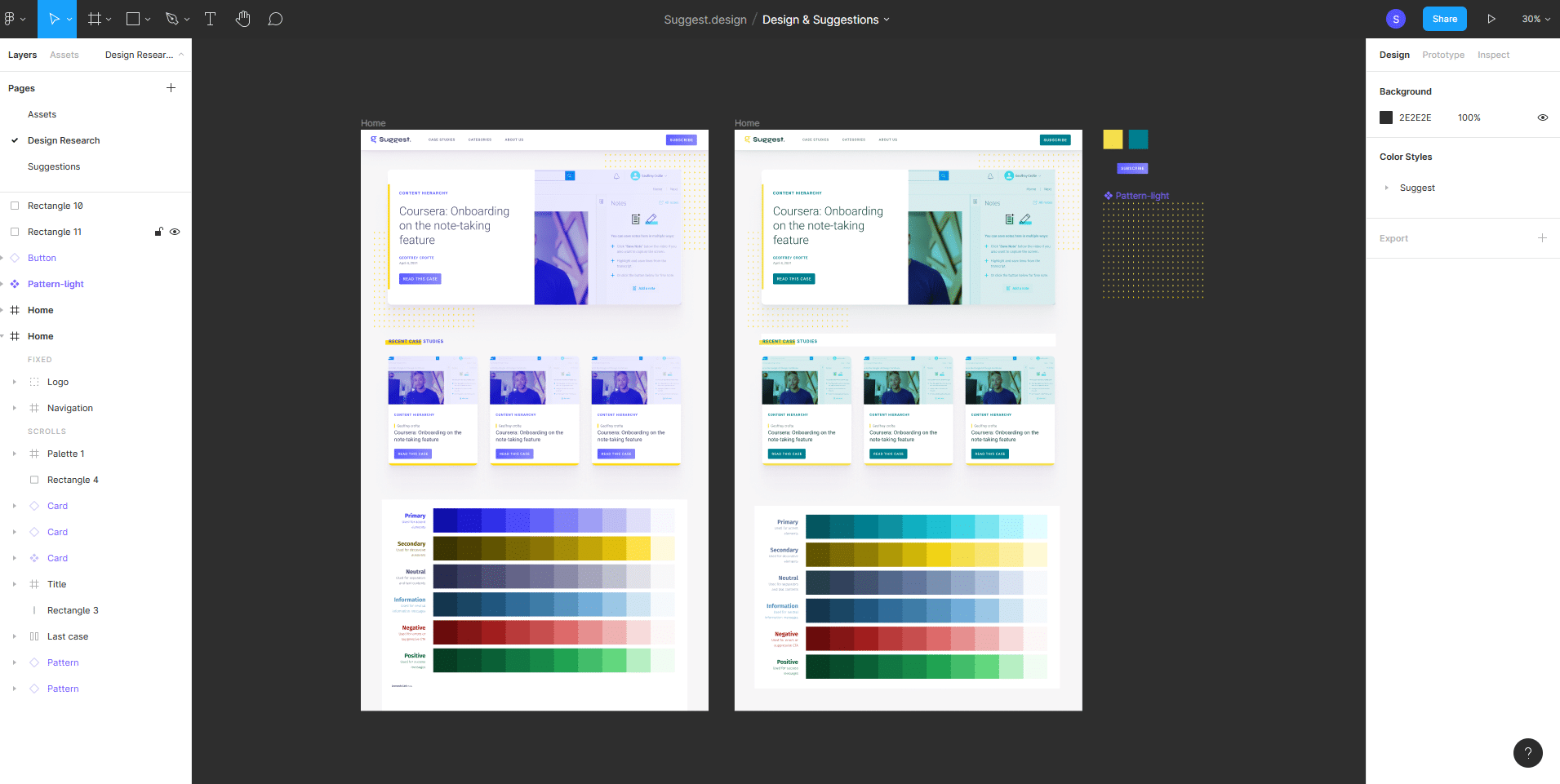
The strength of Webflow, when the theme is well thought out, is its modularity: a large number of reusable blocks and visual styles are predefined and facilitate the creation of new content. For a person with no knowledge of code (web tech), you can quickly make something very clean. For someone like me with some knowledge of code, you can refine a lot of things and push the theme a bit.
Once your content template is published, editing becomes a breeze (the visual editor could be improved though), and so does the evolution of the website. (we already have plenty of other ideas)
Why make design suggestions?
Before being designers, we are users of digital products on a daily basis. Sometimes we are amateur users, sometimes we are more advanced users. In many cases we are users with frustrations. One of our responsibilities as designers is to tackle these problems in the products we develop.
Of course, we don’t know everything, we don’t always have access to end-users, and, as the field also says, you have to make mistakes to learn and move forward.
The three of us therefore decided to propose unsolicited improvements to products we use. The idea is not to revolutionise the entire design of a product, but to iterate on features that are missing or (in our opinion) poorly thought out, or that fall victim to the cognitive biases of their creators.
Help the products we enjoy and use
Even if we do not claim to be read by the brands that make the products we review, we still want to contribute in our own way. It’s also sometimes to get over the nerves of waiting for the product to evolve. (I don’t want to talk instead of my comrades on this point 😁)
We secretly hope that pushing for reflection on certain aspects of the products can improve the daily lives of other users.
Provide design suggestions to help our peers
Many designers are just starting out in the field. I do a lot of one-on-one mentoring, and I’ve realised that there is a lack of resources that deal publicly with real-life cases. These case studies allow us to remain critical even on products that seem “finished”. (A bit like Growth.design but smaller, at the moment :p) It shows that uses can evolve, and that not evolving your product accordingly leaves a lot of room for the competition to flourish.
Indirectly, offering open criticism of certain products exposes us as designers to that same criticism. Of course others will have better ideas than we do. Of course we won’t have thought of everything ourselves, and that’s all right. We are also here to learn, again and again 😊
Good reading!






Post a comment for this article?
Follow comments and trackbacks